ホームに戻る
出典 :
関連 :
目次 :
テンプレート(コントロール・テンプレート)とは
コントロールの機能を保ったまま、外観を任意に変更できる仕組み。
Windows Formsなどの従来のフレームワークでは「ボタンのクリック」といった機能を残しながら外観を一新したい場合、コントロールを一から作成する必要があった。
これは外観の新規作成に加え、「ボタンのクリック」や「テキストの選択」など標準のコントロールに実装されている機能を作り直すことになり、開発負荷が非常に高かった。
WPFではこのコントロール・テンプレートを用いることで外観のみを変更(カスタマイズ)でき、Windows Formsと比較して大幅に開発負荷を低減することができる。
テンプレートは強力で、カスタマイズできる内容は多岐に渡る。詳細は出典元を参照のこと。
尚、このコントロール・テンプレートを用いて作成されたカスタマイズ可能なコントロールを「カスタムコントロール」と呼ぶ。
基本的な例
<Button>
<!-- Button.Template に ControlTemplate を設定 -->
<Button.Template>
<ControlTemplate TargetType="Button">
<Ellipse Fill="LightBlue" Width="80" Height="30"/>
</ControlTemplate>
</Button.Template>
</Button>
上記は、テンプレートを用いてボタンの外観を水色の楕円に変更している。
コントロール(ここでは Button )の Template プロパティに ControlTemplate クラスのインスタンスを設定するのがテンプレート適用の基本的な手順となる。
ControlTemplate クラス
ControlTemplate クラスはコントロールの「視覚的な構造と動作」を司る。
- 視覚的構造 : コントロールがどのような要素( FrameworkElement )で構成されているか
- 視覚的動作 : コントロールが特定の状態になったときにどのように表示するか
既存のコントロールは Background (背景色)、Foreground (前景色 : フォントの色)、FontFamily (フォント種別)などの外観に関わるプロパティを備えているが、
これらの変更だけでは必要な外観を得られない場合に ControlTemplate を作成することになる。
ControlTemplate の作成例
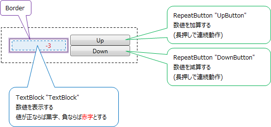
下図のような NumericUpDown コントロールを作成する場合を考える。(出典)
( NumericUpDown はWindows Formsでは標準コントロールに含まれているが、WPFでは除外されている。)
XAML(特定のコントロールに紐づかない - 例 : themes/generic.xaml)
<!-- リソース定義 -->
<ResourceDictionary
xmlns="http://schemas.microsoft.com/winfx/2006/xaml/presentation"
xmlns:x="http://schemas.microsoft.com/winfx/2006/xaml"
xmlns:local="clr-namespace:VSMCustomControl">
<!-- スタイル定義 -->
<!-- ( VSMCustomControl.NumericUpDown 向け) -->
<Style TargetType="{x:Type local:NumericUpDown}">
<Setter Property="Template">
<Setter.Value>
<!-- コントロール・テンプレート定義 -->
<!-- ( VSMCustomControl.NumericUpDown 向け) -->
<ControlTemplate TargetType="local:NumericUpDown">
<Grid Margin="3"
Background="{TemplateBinding Background}">
<!-- 視覚的動作( VisualState )の定義 -->
<VisualStateManager.VisualStateGroups>
<VisualStateGroup Name="ValueStates">
<!-- Value が負ならば TextBlock のフォントを赤字にする -->
<VisualState Name="Negative">
<Storyboard>
<ColorAnimation To="Red"
Storyboard.TargetName="TextBlock"
Storyboard.TargetProperty="(Foreground).(Color)"/>
</Storyboard>
</VisualState>
<!-- Value が正ならば TextBlock のフォントを黒字にする(デフォルトに戻す) -->
<VisualState Name="Positive"/>
</VisualStateGroup>
</VisualStateManager.VisualStateGroups>
<!-- 視覚的動作の定義 ここまで -->
<Grid>
<Grid.RowDefinitions>
<RowDefinition/>
<RowDefinition/>
</Grid.RowDefinitions>
<Grid.ColumnDefinitions>
<ColumnDefinition/>
<ColumnDefinition/>
</Grid.ColumnDefinitions>
<Border BorderThickness="1" BorderBrush="Gray" Margin="7,2,2,2" Grid.RowSpan="2"
Background="#E0FFFFFF"
VerticalAlignment="Center"
HorizontalAlignment="Stretch">
<!-- TextBlock : 数値の表示 -->
<!-- ( Value プロパティにバインド) -->
<TextBlock Name="TextBlock"
Width="60" TextAlignment="Right" Padding="5"
Text="{Binding RelativeSource={RelativeSource FindAncestor,
AncestorType={x:Type src:NumericUpDown}},
Path=Value}"/>
</Border>
<!-- RepeatButton : 加算 -->
<RepeatButton Name="UpButton" Content="Up"
Margin="2,5,5,0" Grid.Column="1" Grid.Row="0"/>
<!-- RepeatButton : 減算 -->
<RepeatButton Name="DownButton" Content="Down"
Margin="2,0,5,5" Grid.Column="1" Grid.Row="1"/>
</Grid>
</Grid>
</ControlTemplate>
<!-- コントロール・テンプレート定義 ここまで -->
</Setter.Value>
</Setter>
</Style>
</ResourceDictionary>
NumericUpDown のコード(XAMLに紐づかない)
using System.Windows;
using System.Windows.Controls;
using System.Windows.Controls.Primitives;
using System.Windows.Input;
using System.Windows.Media;
namespace VSMCustomControl
{
// テンプレート宣言
[TemplatePart(Name = "UpButtonElement", Type = typeof(RepeatButton))]
[TemplatePart(Name = "DownButtonElement", Type = typeof(RepeatButton))]
[TemplateVisualState(Name = "Positive", GroupName = "ValueStates")]
[TemplateVisualState(Name = "Negative", GroupName = "ValueStates")]
public class NumericUpDown : Control
{
// コンストラクタ
public NumericUpDown()
{
DefaultStyleKey = typeof(NumericUpDown);
this.IsTabStop = true;
}
// 依存関係プロパティ ValueProperty 宣言
// (プロパティ変更時のコールバックとして ValueChangedCallback() を登録)
public static readonly DependencyProperty ValueProperty =
DependencyProperty.Register( "Value",
typeof(int),
typeof(NumericUpDown),
new PropertyMetadata( new PropertyChangedCallback(ValueChangedCallback) ) );
// プロパティ Value 宣言
// ( ValueProperty のラッパープロパティ)
public int Value
{
get { return (int)GetValue( ValueProperty ); }
set { SetValue( ValueProperty, value ); }
}
// Value 変更時のコールバック
private static void ValueChangedCallback( DependencyObject obj,
DependencyPropertyChangedEventArgs args)
{
NumericUpDown ctl = (NumericUpDown)obj;
int newValue = (int)args.NewValue;
// 表示状態を更新
ctl.UpdateStates(true);
// ValueChanged イベントを発生させるために OnValueChanged() をコール
ctl.OnValueChanged( new ValueChangedEventArgs(NumericUpDown.ValueChangedEvent, newValue) );
}
// ValueChanged ルーティングイベント
public static readonly RoutedEvent ValueChangedEvent =
EventManager.RegisterRoutedEvent( "ValueChanged",
RoutingStrategy.Direct,
typeof(ValueChangedEventHandler),
typeof(NumericUpDown) );
// イベントプロパティ ValueChanged
public event ValueChangedEventHandler ValueChanged
{
add { AddHandler(ValueChangedEvent, value); }
remove { RemoveHandler(ValueChangedEvent, value); }
}
// Value 変更時の処理
protected virtual void OnValueChanged(ValueChangedEventArgs e)
{
// Value の変更を親子に通知するため ValueChanged イベントを発行
RaiseEvent(e);
}
// 表示状態の更新
private void UpdateStates( bool useTransitions )
{
// Value が 0 以上ならば "Positive" 、そうでなければ "Negative" を適用する
if (Value >= 0)
{
VisualStateManager.GoToState(this, "Positive", useTransitions);
}
else
{
VisualStateManager.GoToState(this, "Negative", useTransitions);
}
}
// テンプレート適用時の処理
public override void OnApplyTemplate()
{
UpButtonElement = GetTemplateChild("UpButton") as RepeatButton;
DownButtonElement = GetTemplateChild("DownButton") as RepeatButton;
UpdateStates(false);
}
// 「Up」ボタン(フィールド / プロパティ)
private RepeatButton upButtonElement;
private RepeatButton UpButtonElement
{
get { return upButtonElement; }
set
{
// Click ハンドラを削除、再割り当て
if (upButtonElement != null)
{
upButtonElement.Click -= new RoutedEventHandler(upButtonElement_Click);
}
upButtonElement = value;
if (upButtonElement != null)
{
upButtonElement.Click += new RoutedEventHandler(upButtonElement_Click);
}
}
}
// 「Up」ボタンクリック時の処理
void upButtonElement_Click(object sender, RoutedEventArgs e)
{
Value++;
}
// 「Down」ボタン(フィールド / プロパティ)
private RepeatButton downButtonElement;
private RepeatButton DownButtonElement
{
get { return downButtonElement; }
set
{
// Click ハンドラを削除、再割り当て
if (downButtonElement != null)
{
downButtonElement.Click -= new RoutedEventHandler(downButtonElement_Click);
}
downButtonElement = value;
if (downButtonElement != null)
{
downButtonElement.Click += new RoutedEventHandler(downButtonElement_Click);
}
}
}
// 「Down」ボタンクリック時の処理
void downButtonElement_Click(object sender, RoutedEventArgs e)
{
Value--;
}
}
}
解説
テンプレート( ControlTemplate )の定義をXAMLのみで完結させることがポイント。このファイルは特定のコントロールに紐づかず、一つのファイルに複数のテンプレート定義を格納することも可能。
視覚的動作( VisualState )として、表示値が正および負になった際のフォント色をそれぞれ規定している。
XAMLでは外観のみを規定し、視覚的動作の適用はコードに一任していることに注意。即ち、想定通りの視覚的動作となるかはコードの実装に依る。
(表示値が正の場合に黒字、負の場合に赤字とすることを想定しているが、コードの実装次第では逆、もしくはさらに異なる動作も可能である。)
視覚的構造( TextBlock 、RepeatButton 、Border の配置)の定義も同様にテンプレートに含まれている。
尚ここでは、テンプレートをリソースとして定義している。
これはテンプレートの定義としては一般的な手法で、スタイル / リソース化で複数のコントロールへの適用が容易となる。
コードではコントロール全体の動作と、テンプレートの適用方法を規定している。コントロールの状態は主に以下のタイミングで変化するため、それらに対応する処理を記述している。
- テンプレートがコントロールに適用されたとき ⇒ OnApplyTemplate()
- プロパティが変化したとき ⇒ ValueChangedCallback()
- イベント(主にユーザ操作)が発生したとき ⇒ downButtonElement_Click() / upButtonElement_Click()
ここで Control.OnApplyTemplate() は、コントロールにテンプレートが適用された際のコールバックである。
冒頭のテンプレート宣言と OnApplyTemplate() とで、テンプレートの適用方法を規定している。
カスタムコントロールとユーザーコントロールとの比較
前述のように、テンプレートを用いて作成したコントロールをカスタムコントロールと呼ぶが、これは「ユーザーコントロール」とは異なる。
ユーザーコントロールは複数のコントロールを比較的簡単に一つにまとめることができるが、カスタムコントロールのような外観のカスタマイズは不可能である。
これは、Control から派生したオブジェクトには ControlTemplate が適用できるが、UserControl は例外的に ControlTemplate が適用できないことによる。
テンプレートの仕様は多岐に渡るため、特に複雑なカスタマイズが必要ないのであれば、ユーザーコントロールを用いるほうが簡便である。
(前述の NumericUpDown 程度であれば、ユーザーコントロールでも作成が可能である。)